

As part of the 25-year anniversary celebrations for the Class of 1993, we are pleased to highlight Abrar Qureshi. As you will see from the conversation below, Abrar is another star alumnus and brings … [Read More...]
Alumni Awards & Distinctions
Dr. Bakht Roshan nominated for ‘Public Health Champion Award’ by State of California’s Madera County
Dr. Bakht Roshan is a graduate of AKU Class of 2000 and an Infectious Disease specialist affiliated with Madera Commonity Hospital (MCH), Madera, California. In order to prepare for the COVID-19 surge, MCH formed a committee which was led by Dr. … [Read More...]
Dr. Tahseen Mozaffar wins prestigious NIH grant
Dear AKUAANA Family: One of our own has made us immensely proud yet again. The National Institute of Arthritis and Musculoskeletal and Skin Diseases has awarded a 5-year, $4.2 million grant to study sporadic inclusion body myositis (sIBM), … [Read More...]

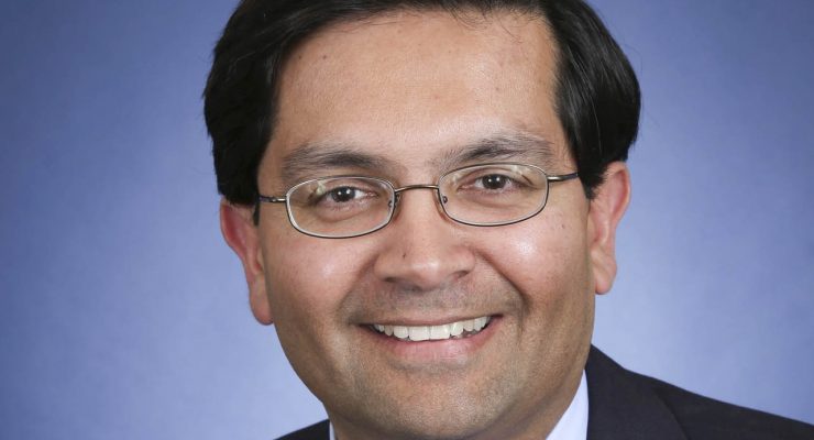
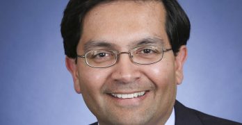
Dr. Nushmia Zia Khokhar appointed to Umoja Biopharma as Chief Medical Officer
Dr. Nushmia Zia Khokhar, from the Class of 1997, has been appointed Chief Medical Officer of Umoja Biopharma, a biotechnology company based in Seattle, WA. Dr. Khokhar is an accomplished oncologist who has spent a significant portion of her … [Read More...]